Sparebanken Vest
Inspiring smarter spending and saving habits through deeper insights.
During my summer internship at Sparebanken Vest, I worked on a project focused on providing customers with better insights into their assets and daily spending habits. The goal was to create tools that help users become more aware of their financial behavior and encourage smarter saving practices through personalised insights. This would in turn promote increased usage of their online banking platform. The project was successfully rolled out to a group of pilot customers, and the feedback so far has been very positive.
Comparative spending analysis
We developed a feature that allows customers to compare their spending habits with others who share similar financial profiles and life situations. This widget aims to provide valuable context and insights, enabling users to make more informed financial decisions.
We developed the logistics and design of this by gaining insights from developers of an economic overview feature within the app. The goal was to create something that provided new customer insights instead of rebranding previous solutions.
Micro savings feature
To promote better financial habits, our team designed a micro-savings feature that links daily savings to specific spending patterns. Through this customers can choose to save money instead of a non-essential purchase, like a daily coffee.
We designed key categories and the user flow for this feature based on statistically popular daily purchases. An important focus was to make it easy to initiate the daily savings, and our insights show that predetermined categories is less of a cognitive load and require less steps than complete customization would.
Down payment overview
As some people save for their fist home in more places than BSU, the team designed a widget where the customer can choose what accounts they wish to include in their savings for a total overview. This is to motivate increased savings and potential loans through the bank later on.
We developed the different states based on what accounts and savings they already have and the logistics behind the “add accounts” feature.
Process
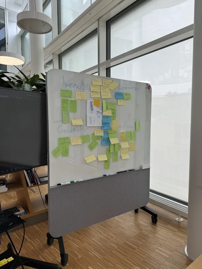
We kicked off the project by doing a set of crazy 8s, involving the whole team to get different perspectives and to establish solid team communication. These ideas were taken into semi-structured interviews, before sketching and developing the different widgets.
We conducted A/B tests through Figma prototypes on some of the smaller features to ensure the interface was easy to navigate. This resulted in a few different widgets that were sketched in Figma before they were put in production.
Key takeaways
Looking back, earlier involvement of us in the UX team would have allowed us to gather more customer insights to strengthen our ideation phase. If we had more time, it would have been great to implement our designs in full production for some employee pilot testing.
Despite this, the high level of trust and responsibility built a strong sense of engagement within the team. Having easy access to support from senior UX employees led to me grow as a designer and problem solver, but also my communicative skills as a team member.


